48 Maps
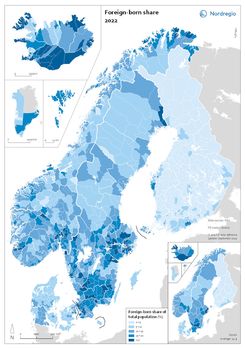
Foreign-born share 2022
This map shows the share of foreign-born of the total population in the Nordic countries. This map shows the share of foreign-born of the total population in Nordic municipalities (big map) and regions (small map), and municipalities (big map) in 2022. Iceland has the highest share of foreign-born residents in the Nordic Region, at 22%. Mýrdalshreppur, the municipality in the south containing the village of Vik, has the largest foreign-born population, at 58%. It is also the only municipality in the Nordic Region with a majority non-native population. Other municipalities in the south, some of which are quite small, also have significant foreign-born populations. Reykjanesbær, near Keflavik airport, is the largest municipality with a sizeable foreign-born population, at 29%. In Reykjavíkurborg, 20% of the population is foreign-born, about the same as the national average. Many municipalities with tiny populations in the Westfjords and the north also have small shares of foreign-born persons. In 2022, 17% of the population of Norway was foreign-born. Municipalities with high shares of foreign-born include Oslo (28%), several suburban municipalities near Oslo, and a few in the north – which have small overall populations but large numbers of foreign workers employed in the fishing industry. In Sweden, 20% of residents are foreign-born, with large differences in distribution by region and municipality. At the regional level, Stockholm has the highest share of foreign-born persons (27%), followed by Skåne, including the city of Malmö (24%). The percentage of foreign-born persons in Västra Götaland, which encompasses Gothenburg, is the same as that of Sweden as a whole. The regions with low shares of foreign-born persons are in the north of the country – Dalarna, Gävleborg, Västernorrland, Jämtland, Västerbotten, and Norrbotten – plus the island of Gotland, which has the lowest share (9%). There are no municipalities in which foreign-born…
 2025 April
 - Demography
- Migration
- Nordic Region
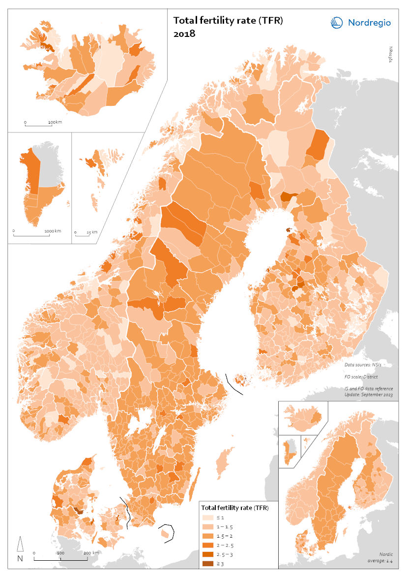
Total fertility rate (TFR) 2018
This map shows the total fertility rate (TFR) in 2018. The total fertility rate is the number of children a hypothetical cohort of women would have in one year. Data on total fertility rates is not available at the regional or municipal levels for all of the Nordic countries. The figures are estimated based on multiplying the general fertility rate by 30 (representing the typical number of reproductive years, between 15 and 45), assuming the general fertility rate is constant throughout this period. The general fertility rate is the number of births per woman during the childbearing years. At the regional level, age and gender composition are indicative of past trends but also harbingers of future population change. In 2018, prior to the pandemic, most Nordic municipalities had fertility levels in line with their respective national levels. Most municipalities within Greenland and the Faroes had fertility rates above 1.5 children per woman, consistent with national rates of about 1.9. Municipalities in Sweden and Denmark typically had fertility rates of 1.5 or higher, consistent with their national rates of 1.7. By contrast, many municipalities in Norway and Finland had fertility rates of 1.5 or lower. Iceland and Åland also showed varying rates across municipalities, ranging from 1 to over 1.5.
- 2025 April
- Demography
- Nordic Region
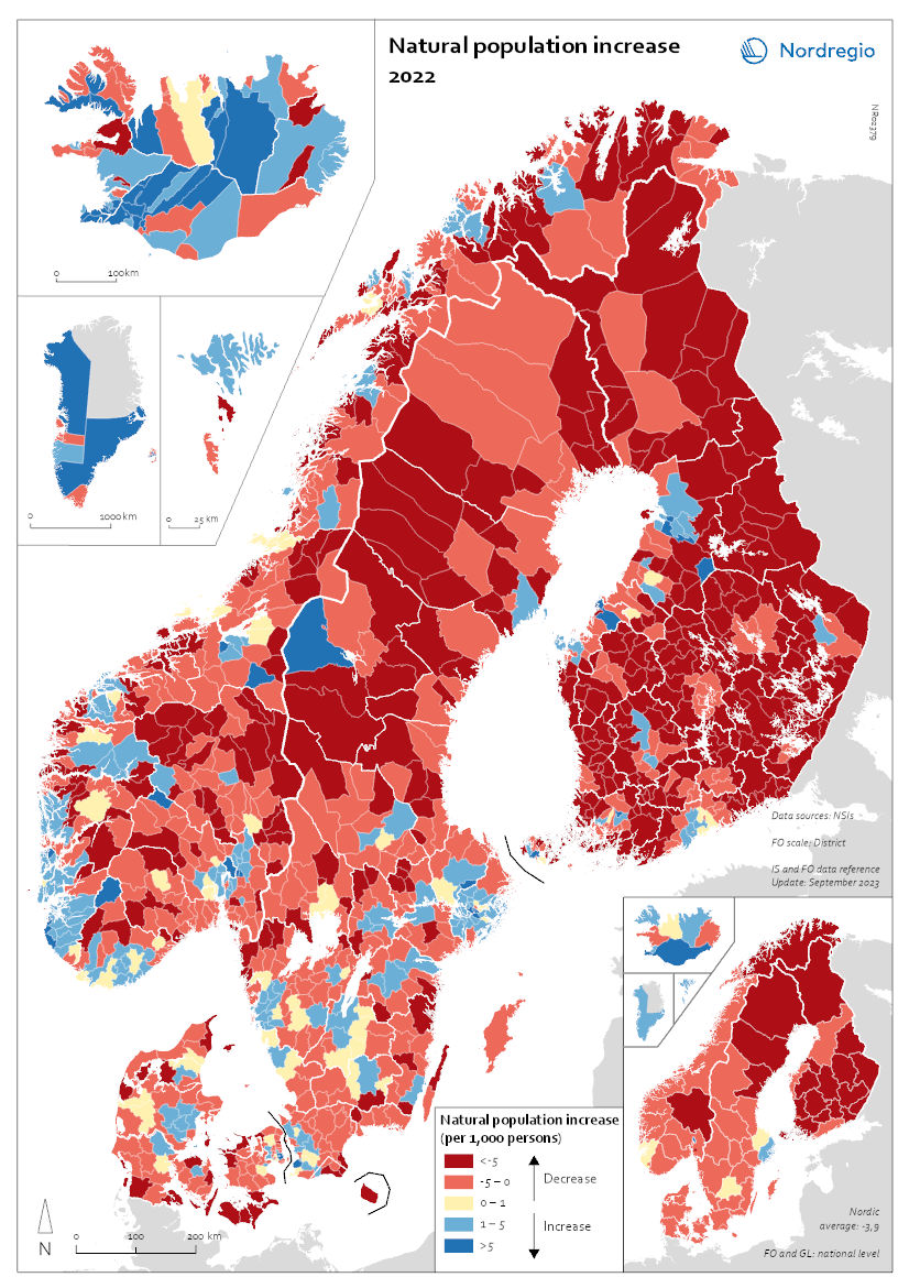
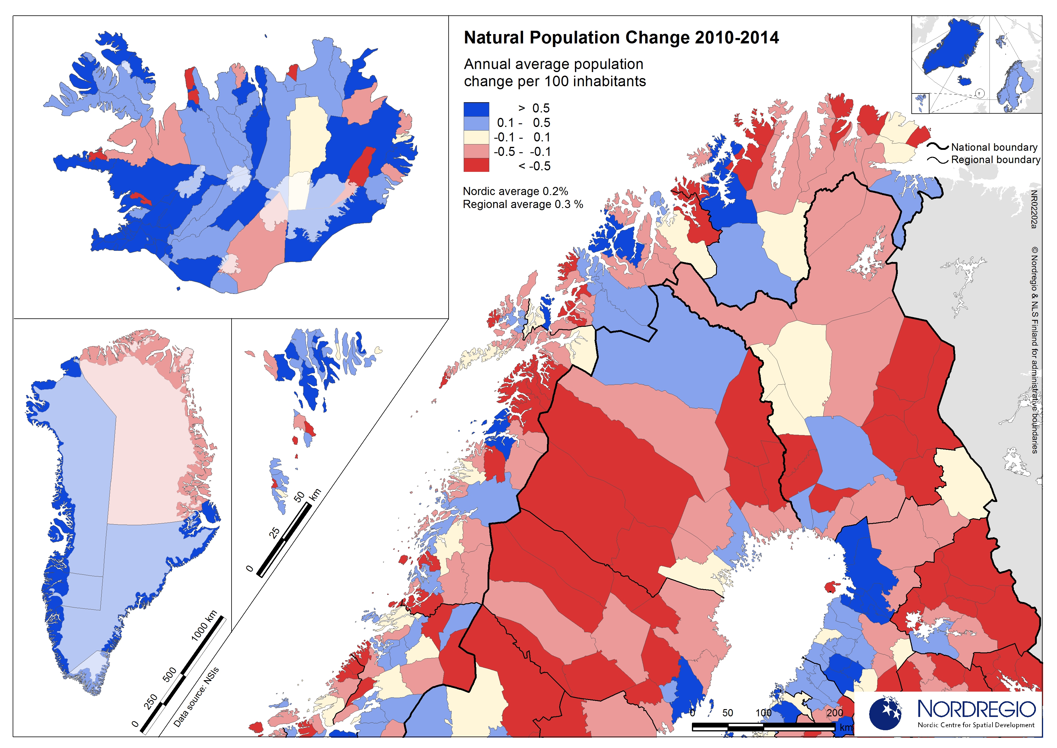
Natural population increase 2022
This map shows the natural population change per 1,000 persons in 2022. This map shows the natural population change per 1,000 persons in 2022 (i.e. between 1 Jan and 31 Dec 2022). Natural population change refers to births minus deaths (i.e. population change disregarding migration). The small map shows the result on a regional level, and the big map shows changes on the municipal level. Red shades refer to population decrease, blue shades to population increase, and yellow shades to balanced development. The map shows that levels of natural population change do not only vary across but also within the Nordic countries. Urban areas such as Stockholm and Gothenburg in Sweden; Oslo and Bergen in Norway; Copenhagen and Aarhus in Denmark; as well as Helsinki and Turku in Finland all experienced positive natural population change. This can be attributed to the comparatively young population age structure of these urban centres. Young people of child-bearing age often cluster in cities for study and work, and many start families there. By contrast, rural and remote areas often have a higher proportion of older people and, as such, tend to register more deaths than births, resulting in negative natural population change. These patterns are particularly pronounced in Finland but also in the northern parts of Sweden and Norway. Nonetheless, there are exceptions. In Iceland, Greenland, and the Faroe Islands, which had comparatively high levels of natural population growth at national level, a majority of municipalities, including many in rural areas, still registered more births than deaths in 2022 (77% of municipalities in Iceland, 60% in Greenland, 67% on the Faroe Islands). In the other Nordic countries, only a minority of municipalities, mostly in urban centres, recorded natural population increase in 2022 (30% in Norway and Sweden, 26% in Denmark, 12% in Finland).
- 2025 April
- Demography
- Nordic Region
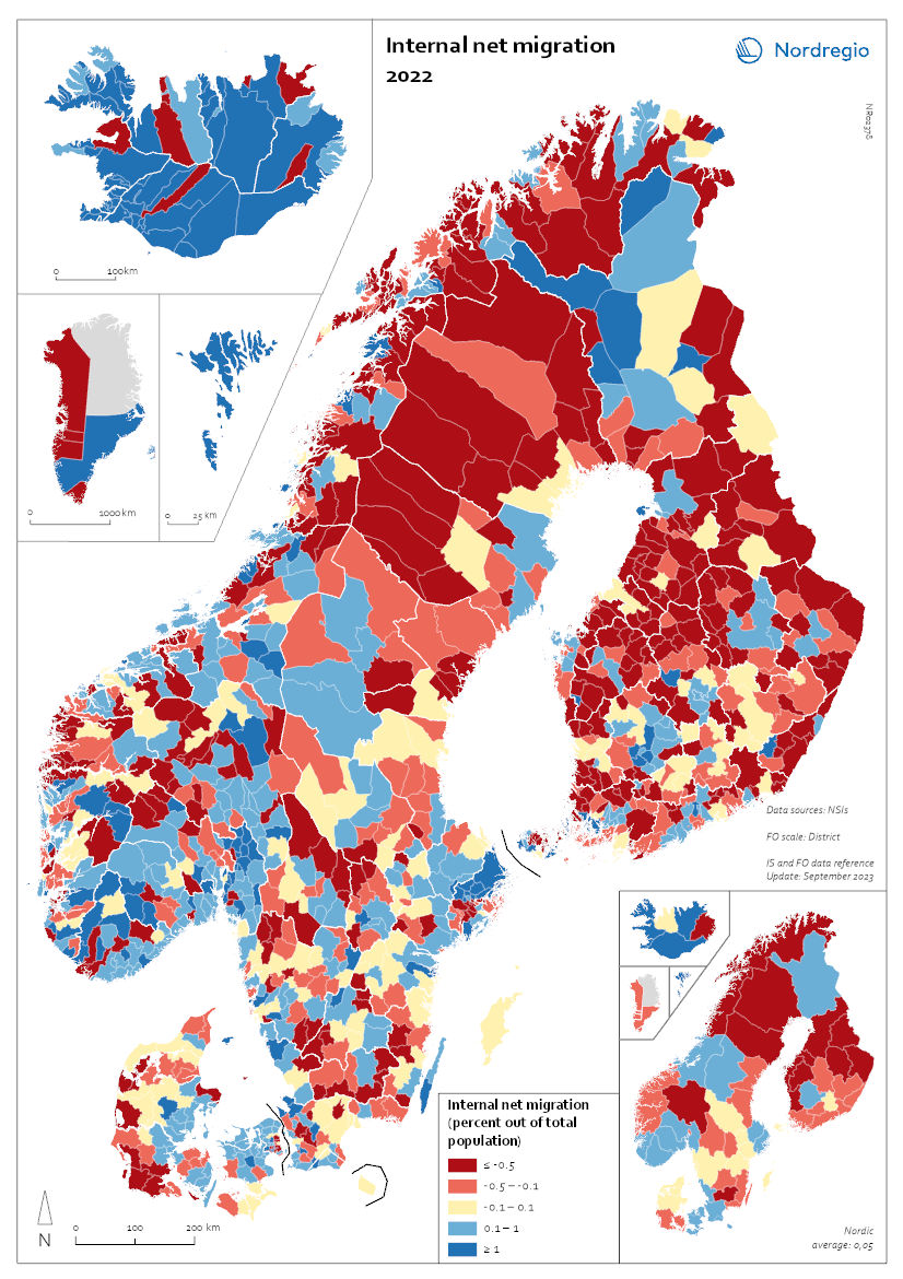
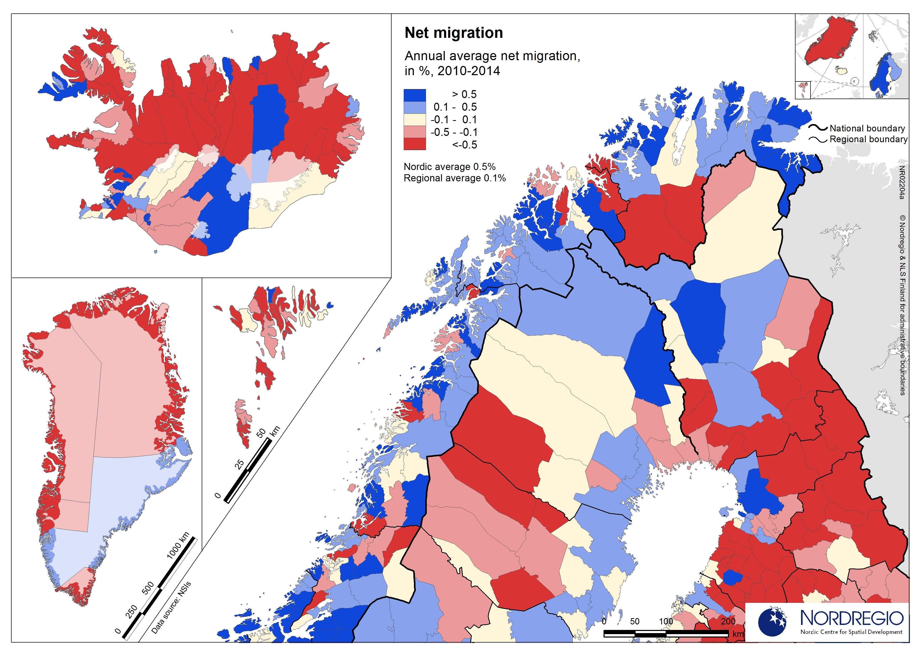
Internal Migration 2022
This map shows the internal net migration in 2022 as a percentage of the total population. This map shows the internal net migration in 2022 as a percentage of the total population. The small map shows the result on a regional level, and the big map on the municipal level. Internal (sometimes referred to as domestic) net migration refers to migration between municipalities and regions within the same country. International migration is excluded. In 2022, internal net migration was positive (indicated by shades of blue) or at least balanced (shown in yellow) in several municipalities in central and southern Sweden and Norway, as well as in central and northern Finland – areas that traditionally were more likely to lose population due to internal migration. Conversely, several municipalities in the capital regions – such as Stockholm, Oslo, and Copenhagen – exhibited negative internal net migration. Several municipalities across the Nordic Region, including in more remote and rural areas, continued to register positive internal net migration in this year. In Iceland, positive migration predominated in most of the municipalities, and the Faroe Islands also presented positive net migration. Greenland oscillated mainly between positive and negative migration flows, while Åland presented the whole spectrum of positive, balanced, and negative net migration for this year.
- 2025 April
- Demography
- Nordic Region
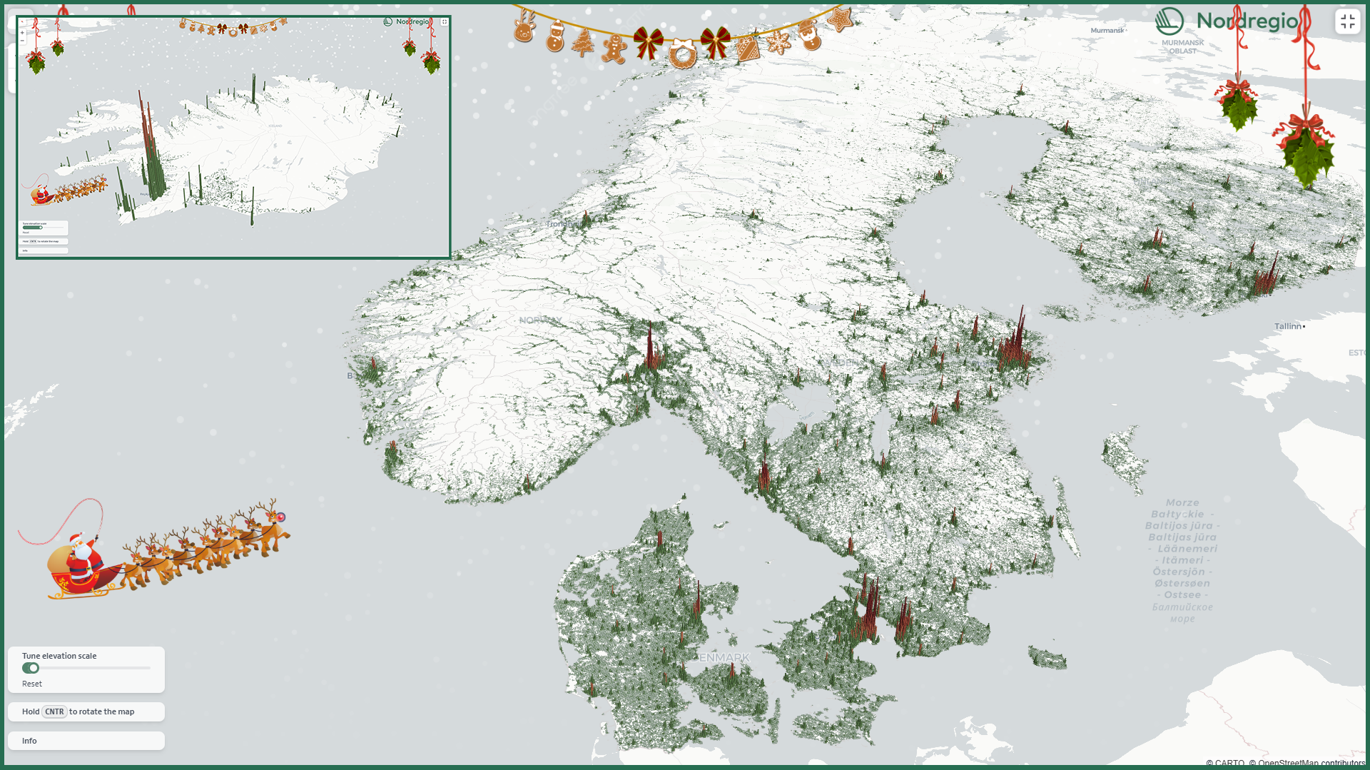
A 3D population map for the holiday season
This Christmas, we’re gifting all fellow data nerds our first-ever interactive 3D map! The map displays the number of residents in each 1km grid cell, with the height of the bars representing the number of residents in each area.
- 2024 December
- Demography
- Nordic Region

Voting turnout in national elections
Voting turnout in 2023 (or latest national election). The map illustrates voter turnout as a percentage point relative to national averages, highlighting differences in participation levels between countries. This method removes inter-country differences in participation levels, providing a clearer view of the urban-rural divide. Lower turnout is observed in eastern Finland, northern Sweden, and the more rural parts of Denmark. In Norway, the lowest turnout occurs in the north and in municipalities outside Oslo. Nationally, the highest voter turnouts are in the Faroe Islands (88%), Sweden (84.2%), and Denmark (84.16%). Lower participation rates are found in Iceland (80.1%), Norway (77.2%), Finland (68.5%), and Greenland (65.9%).
- 2024 May
- Nordic Region
- Others
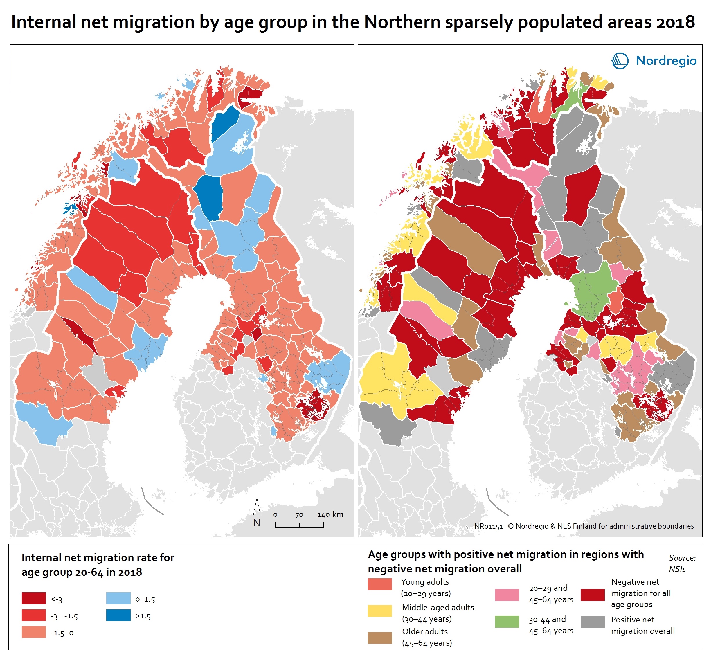
Internal net migration by age group in the Northern sparsely populated areas 2018
This map shows the internal net migration rate in 2018 (left map) and net migration by age group (right map) in local labour market areas of the Northern sparsely populated areas in 2018 The map on left shows the internal net migration rate in the NSPAs in 2018. Although many regions experienced negative net migration, this was not the case for all segments of the population. The map on the right of shows the age groups in which more people moved in than moved out, despite these regions having negative net migration overall. The red colours on the map on the left indicates a net out-migration, while the blue colours indicate a positive net migration. In the map on the right, the red colours indicate net out-migration for all age groups and the grey positive net migration overall. The other colours indicate age groups with a positive net migration (while having negative net migration overall). Inward and outward migration are slightly different in the local labour market areas (LLMAs) compared to the independent labour markets. Among the LLMAs, Rovaniemi is the only one that has positive net migration in all age groups. This positive development may be due to the number of governmental offices, the strength of the tourism industry and the presence of two universities. On the contrary, 18 local labour market areas– four in Sweden, nine in Norway and five in Finland – have negative net migration in all age groups. Out-migration of young adults is seen in most of LLMAs, the exceptions being Umeå, Målsev, Joensuu and Oulu. The inflows of young adults in these regions reflect the presence of the universities in Umeå, Joensuu and Oulu and the army bases in Målselv. Despite this positive inflow, most of these LLMAs are unable to retain adults in…
- 2020 February
- Demography
- Labour force
- Migration
- NSPA and North Atlantic

Early school leavers in 2014 by NUTS 2 regions
Persons with at most lower secondary education as share of total population aged 18-24 The map indicates variations within the Nordic countries with the lowest rates of early school leaving found in Swedish regions. In six of the eight Swedish NUTS 2 regions (riksområden) early school leavers make up less than seven percent of the population aged 18-24 years. Hovedstaden in Denmark is the only other Nordic region with a similar rate. In Finland (suuralue/storområde) and Norway (landsdel), variations between the NUTS 2 regions are bigger than in Sweden and Denmark. In the northernmost Finnish region, Pohjois- ja Itä-Suomi (North & East Finland), early school leavers make up a small portion of the population aged 18-24 years, below both the EU average (11.1%) and the two southernmost Finnish NUTS 2 regions. In the Faroe Islands, Iceland, Northern Norway, and, in particular, Greenland, the percentage of the population aged 18-24 years with lower-secondary school as their highest level of education is well above the EU average. With respect to gender, the balance is fairly even in northern Sweden and northern Norway. All other countries and regions included in the map show patterns consistent with the EU average, with males making up a larger portion of the early school leaving population.
- 2016 October
- Labour force
- NSPA and North Atlantic